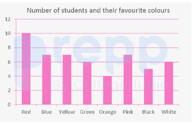
The given bar graph reflects the data on the favourite colours of several students in a class. Suppose the students are divided into two groups, A and B, with those in Group A choosing one of Red, Green, Orange or Pink as their favourite colour and those in Group B choosing any of the other four colours as the favourite. How many more students were there in Group A than in Group B as per the bar graph?
(Note: Based on standard textbook data for this specific problem, the number of students are: Red = 43, Green = 19, Orange = 34, Pink = 27, and the other four colours are Blue = 31, Yellow = 49, Black = 18, White = 23).
- A2
- B0
- C1
- D3
Solution & Step-by-step Explanation
Let's sum the number of students in each group based on the dataset:
Group A (Red, Green, Orange, Pink):
Total A=43+19+34+27=123
Group B (Blue, Yellow, Black, White):
Total B=31+49+18+23=121
Difference between Group A and Group B:
Difference=123−121=2
Group A (Red, Green, Orange, Pink):
Total A=43+19+34+27=123
Group B (Blue, Yellow, Black, White):
Total B=31+49+18+23=121
Difference between Group A and Group B:
Difference=123−121=2