100% Free
SSC Selection Post 2023 Higher Secondary Level Question Paper (27 Jun, 2023) (Shift 3)
Medium 100 Questions 180 min 100 marks
⚡ Live Test Mode Available
Take this as a timed mock test
180 min · 100 marks · Full test mode with leaderboard
Advertisement
Mock Test Questions
100medium5
Questions
0
Attempted
0
Correct
0
Wrong
0/5 attempted
Question No: 1Difficulty: mediumMarks: 1mcq
Select the combination of letters that when sequentially placed in the blanks of the given series will complete the series.ABZ, BCY, CDX, DEW, _ _ _
Question No: 2Difficulty: mediumMarks: 1mcq
Select the figure from among the given options that can replace the question mark (?) in the following series.Note: The sequence comprises a non-verbal diagrammatic progression where features rotate or move systematically across four steps.
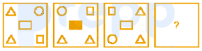
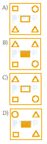
Question No: 3Difficulty: mediumMarks: 1mcq
In this question, three statements are given, followed by two conclusions numbered I and II. Assuming the statements to be true, even if they seem to be at variance with commonly known facts, decide which of the conclusions logically follows/follow from the statements. Statements:I. All planets are asteroids.II. All orbits are asteroids.III. No star is an asteroid. Conclusions:I. No planet is a star.II. No star is an orbit.
Question No: 4Difficulty: mediumMarks: 1mcq
'B + D' means 'B is the father-in-law of D'.'B & D' means 'B is the brother of D'.'B # D' means 'B is the wife of D'.'B D' means 'B is the son of D'.'B @ D' means 'B is the mother of D'. If O is the only child of his parents, then which of the given options is true in reference to the following expression?M # L & N @ O P + R
Question No: 5Difficulty: mediumMarks: 1mcq
Select the correct combination of mathematical signs to sequentially replace the signs and balance the given equation.15 5 16 15 2 61
✓ Showing questions 1–5 of 100 — use the page buttons below to practice the rest
You May Also Like
📊 Track Your Progress
Know exactly where you stand
Save scores, track weak topics, compare with toppers — all free.
Advertisement